
A friendlier, more visible brand
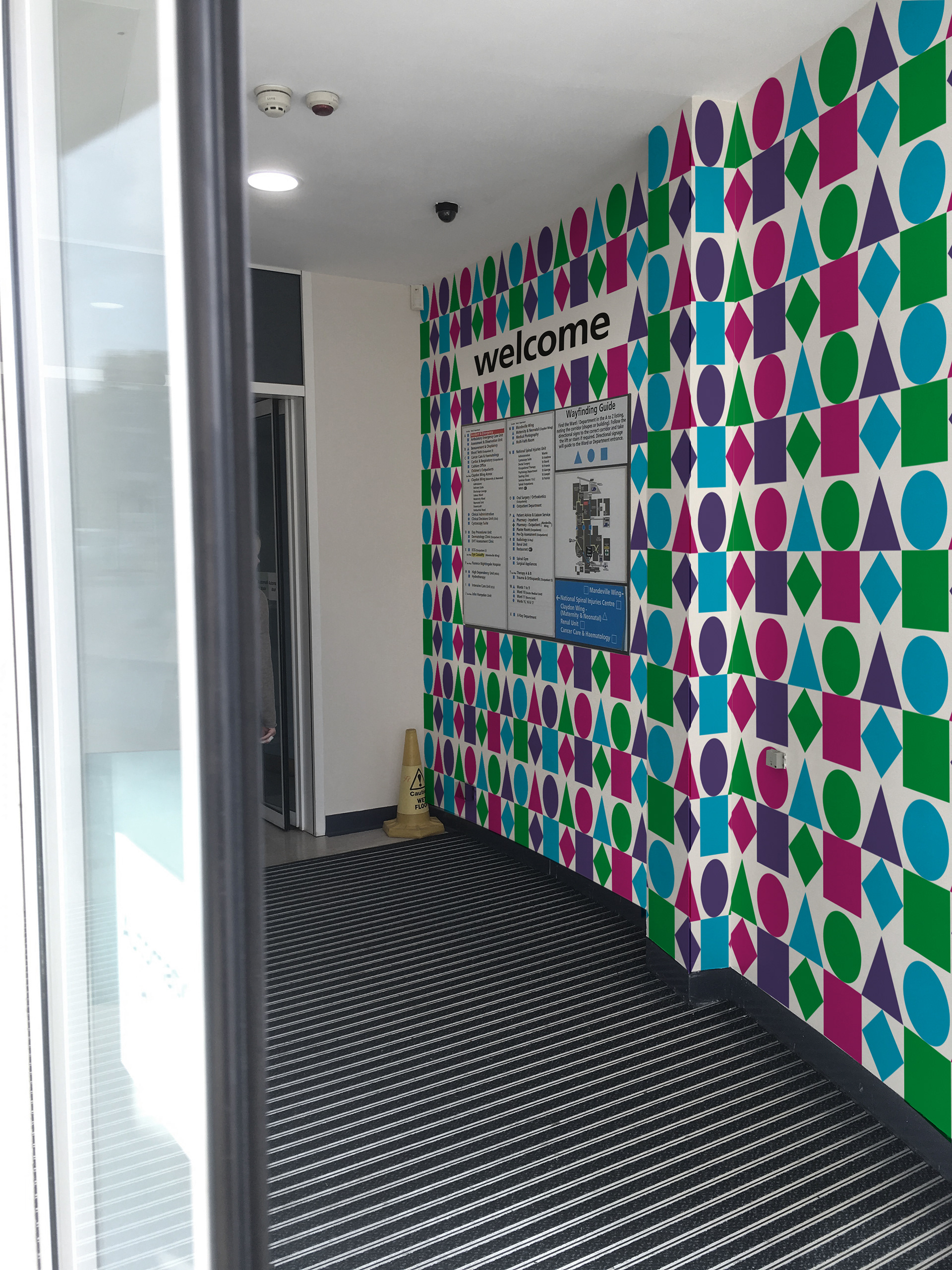
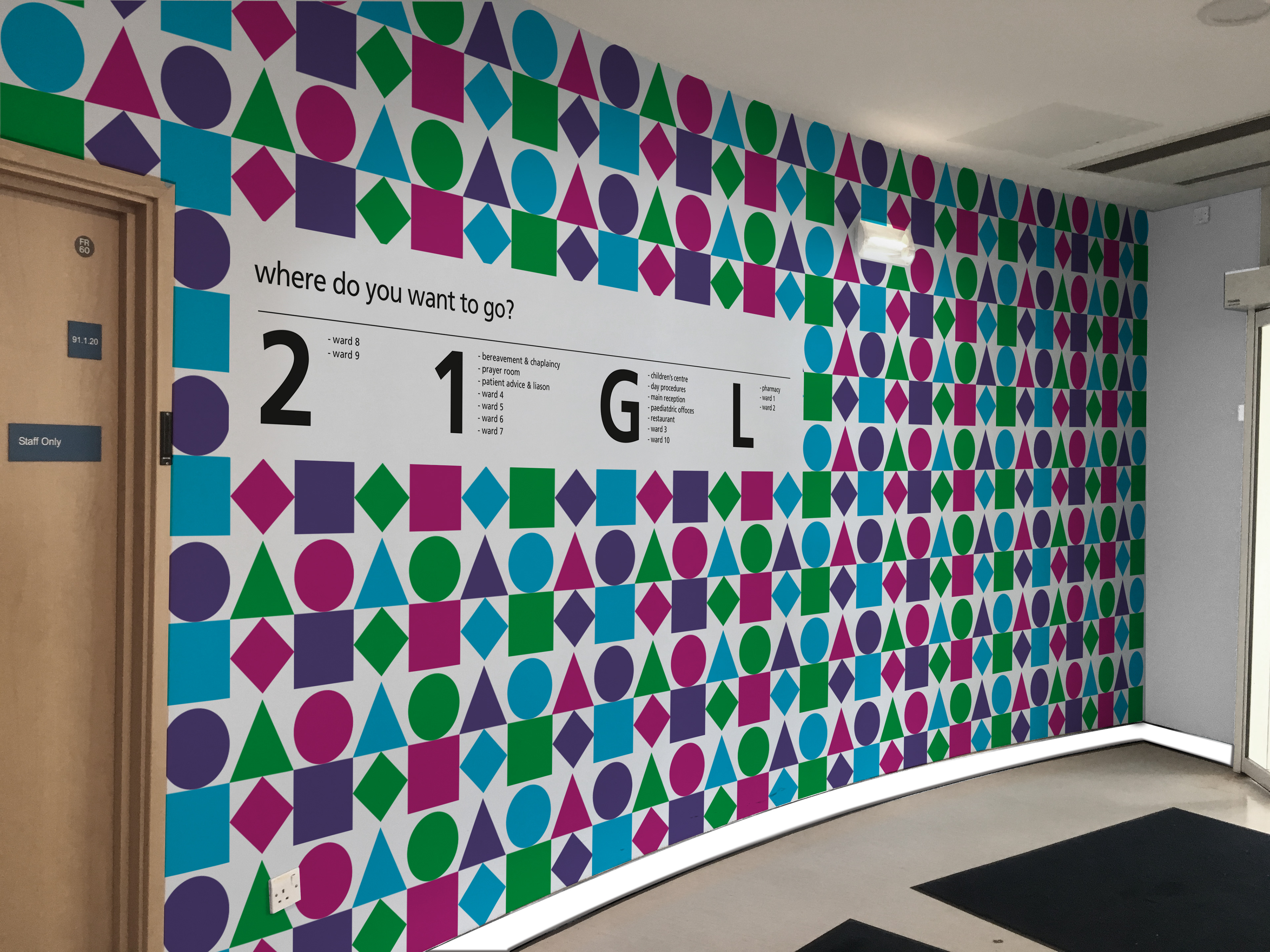
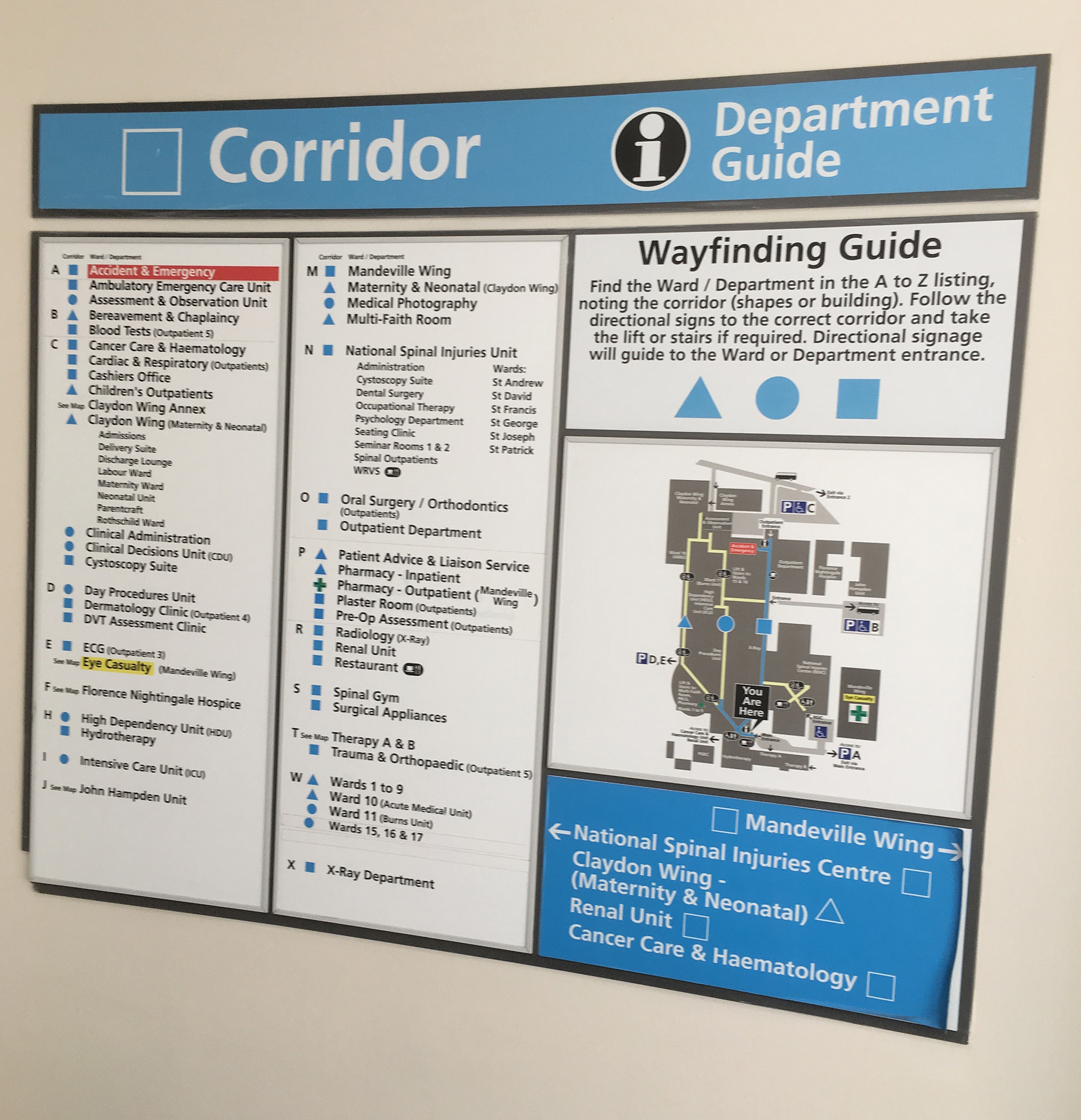
One of the key problems, highlighted on our visit to the Stoke Mandeville Hospital was the fact that patients and visitors found it difficult to navigate the hospital. To address this we have taken the original circle, square, diamond and triangle symbols and built the brand around these. By putting these symbols at the forefront of the brand, you are taking elements that people already recognise and making them highly visible. The fact that Stoke Mandeville, Wycombe and Amersham all use these symbols (shown below right) is a great way of unifying the hospitals. We proposed that each hospital could have their own unique pattern made up of these shapes.


Large vinyl graphics were suggested for the main corridors of the hospital, with the relevant shape from the map used to create a pattern.
Building on the simple geometric shape theme, Overlapping the shapes form graphics such as a heart, blood droplet or pills, relating to the content. The simple shapes and vibrant colour scheme create a much friendlier tone.

